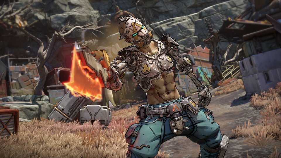
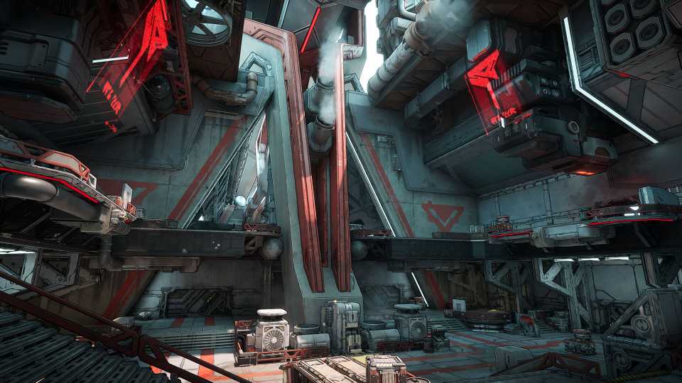
Generally speaking, looter shooters can be a tad difficult for newcomers of the genre to get into. While the general gameplay is often very familiar for fans of first-person shooters, the core loop of constantly trading weapons and equipment for better gear might feel a little strange to those who are more used to sticking with one loadout for the long haul. That's why games like Borderlands 4 go out of their way to be as approachable as possible.
Along with a well-integrated tutorial, Borderlands 4 is home to a plethora of on-screen hints that guide new players gently throughout much of their first journey on Kairos. Despite featuring more mechanics and a vast open world, Borderlands 4 is by far the most approachable entry in franchise history. But in its attempt to streamline its gameplay loop for newcomers, Borderlands 4 loses a core part of its identity, and even feels like a step back in some ways.
Borderlands 4's Menu UI Exchanges Identity for False Practicality

Borderlands 4's Menu UI Is Missing That Borderlands Charm
It might seem insignificant or a bit trivial at first glance, but Borderlands 4's menu UI is an integral aspect of the game. A surprising portion of Borderlands 4's runtime is spent equipping weapons, comparing stats, activating missions, checking the map, and rifling through the game's extensive skill trees. And all the while, players are forced to interact with the game's new menu UI, which feels like a big step back in terms of series identity.

Borderlands 3's menu UI may have been a little overwhelming at first, but its bright colors, expressive icons, and stylized font ensured that Borderlands' colorful and vibrant aesthetic extended to all aspects of the game, truly immersing the player in its world at all times. Borderlands 4's menu UI, however, is completely lacking this pivotal sense of style and identity.

Borderlands 4 replaces the bright colors of BL3's menus with an overly generic dark gray color scheme that sucks all life out of the menu-browsing process. Icon art is also simplified across the board, and the unique fonts of each weapon manufacturer are replaced by the same bland text used across the board. Even small changes, like the Vault Hunter portrait being visible on the left side of the screen rather than at the center, make it feel as though Borderlands 4 is trying to hide the series' more colorful, character-focused identity.

Borderlands 4's Menu UI Isn't Even All That Streamlined
It seems very likely that Borderlands 4's UI changes are a result of developer Gearbox wanting to streamline the menu-browsing experience. But while it might look more paired back than previous entries, Borderlands 4's UI actually feels more convoluted in a handful of ways.

When looking at the player's inventory in Borderlands 4, it's difficult to tell what manufacturer the equipped weapon comes from, as only the manufacturer's logo is visible, and half of it fades into the background. The player's cash is also no longer displayed on the inventory screen by default. They instead need to hover over the cash icon and observe the drop-down text box.

On the subject of hovering, Borderlands 4 commits the Destiny 2 sin of forcing console players to use a mouse cursor, which never feels natural to use with a controller. Scrolling menus in Borderlands 4 is also awkward on a controller, with scroll speed being set far too high, and the menu rarely landing on the spot players wanted it to. Though each of these issues seems minor, they all compound to deliver an experience that feels anything but practical or streamlined.

Borderlands 4


-
 OpenCritic Reviews
- Top Critic Avg: 82 /100 Critics Rec: 88%
- Released
- September 12, 2025
- ESRB
- Mature 17+ / Blood and Gore, Intense Violence, Sexual Themes, Strong Language, In-Game Purchases, Users Interact
- Developer(s)
- Gearbox Software
- Publisher(s)
- 2K